
In construction, delays and hazards cost millions—Assignar brings real-time visibility to empower faster communication to make safer decisions
Who are we?
Assignar is a global SaaS platform supporting 800+ contractors in managing infrastructure projects and tracking performance in real-time.
My experience
Over my three years with Assignar, I led core design initiatives across both web and mobile, playing a key role in evolving the platform into a real-time operations hub.
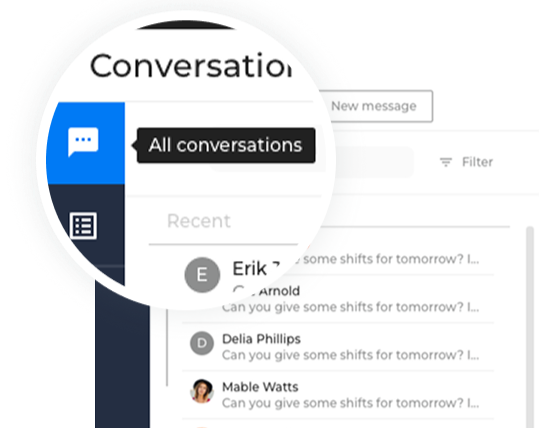
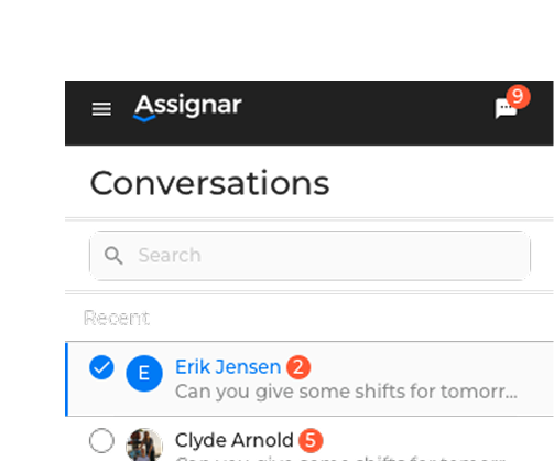
Case#1 - Communicate with live SMS
Overview
Admins were blind to the message delivery, missing replies led to field chaos. This project enables better communication between crews and leadership
My Role
User Research & Data Analysis
Design system
Used Material UI to jump-start
Prototypes & Usability Testing
Worked with PMs, Devs, and QA to deliver the product
UX Impact
75% fewer clicks, better discoverability, and a smoother, more intuitive user experience
Solved 9 ideas requested from customers valued at +23k MRR (Monthly Recurring Revenue)
Reduced support tickets related to missed messages by 40%
Problems
Challenges Faced by Assignar
Rising Support Tickets: Increased issues with missed messages led to a surge in support requests, creating frustration for both customers and the team.
Customer Churn: Users struggled with the tool’s complexity and the endless clicks to access key features, causing frustration and higher churn rates of around 25%.
Users problems
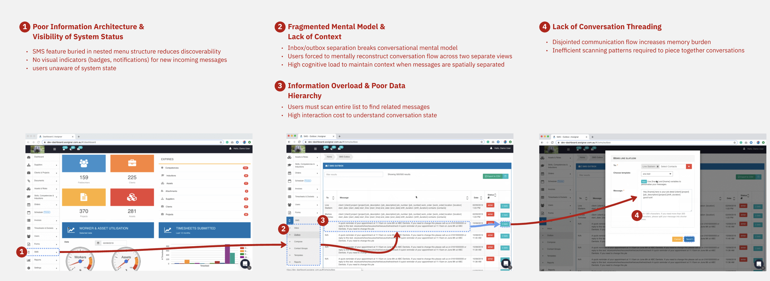
Messaging was fragmented across three hard-to-find areas in the platform, with no system feedback to confirm sent or received messages.
This not only increased the mental load for office admins but also created operational gaps between dashboard and field users.
The goal is to increase user engagement by enhancing transparency
By introducing a unified messaging system that enhances transparency, streamlines scheduling, and fosters seamless communication across operational teams.
By strengthening internal workflows, we aim to increase platform stickiness and long-term adoption, and reduce support tickets related to missing messages.
Discovery Phase
Who are we solving for?
Persona outline

Allan - Allocator
Interviewed +6 allocators
User goals:
Easily communicate with field staff about tasks, updates, compliance requests, and shift changes.
Gain clear visibility into message delivery and response status for improved transparency.
Keep everyone informed on what is happening on the project and keep the project updated and documented
Finding gaps between field and office communication
When 29 customers flagged pain points with Assignar’s messaging feature, it signalled more than just feature requests, it identified recurring friction in workflows and unmet communication needs.
Then partnered with our Customer Success team for additional context and ran interviews with over 6 customers to validate the patterns and dig into the real-world impact.
Analysis
Aha-ideas analysis
Internal interviews
Allocators needed faster, clearer, and more reliable ways to stay aligned from the office to the field.
Users struggled to track conversations—sent and received messages were split across separate menu sections, creating confusion and inefficiency.
Issues on the current conversation process
What do our other sms toolings do better?
#1
Massive texting: Support high-volume texting, flexible targeting, and clear delivery feedback. Office admins must be able to message specific groups of workers and receive confirmation of message delivery or failure.
#2
Customisation: Allowing admins to tailor messages to projects, roles, or scenarios, enabling more relevant, actionable communication.
#3
Message Queueing: Ensure delivery order, retry logic, and status tracking are highly important for transparency, especially when admins need to communicate with large field teams without message delays or loss.
What do our customers want to share with us?
I conducted interviews with six customers to better understand pain points around the existing SMS feature. Insights were documented in Confluence for cross-team access.
#1
Discoverability: Users often avoided using SMS due to its poor visibility within the dashboard.
#2
Utility: SMS was essential for communicating shift updates and compliance reminders, yet it lacked accessibility across the platform.
#3
Responsiveness: Field staff needed to reply instantly—even when away from their computers—highlighting the importance of mobile-friendly functionality.

Delivery Phase
Design and Development
Based on our research, we have developed the following strategy for this project:
Technical Consideration
To avoid building a custom SMS infrastructure from scratch, we leveraged Twilio as our messaging provider. This decision allowed us to move faster but required designing within Twilio’s API capabilities and limitations. I carefully considered delivery constraints, message character limits, error handling, and international messaging rules when defining the user experience. This ensured our solution was technically feasible, scalable, and aligned with both user needs and backend integration requirements
Components audit: Initiated the creation of a new design system, starting with a full audit of existing UI components.
Responsive designs: Designed responsive layouts for multiple breakpoints, with a strong focus on mobile usability and accessibility compliance.
Modular solution: Ensured components were modular and easily reused across different areas of the platform.
Custom Material UI components: Aligned the system with Material UI React to support rapid development, while customising elements to reflect our brand identity.
Tooltips & Tour guide: Introduced a step-by-step wizard flow to guide users through the SMS experience and reduce friction.
Phase-out release: Launched the feature as a limited release to a small group of customers to gather early feedback and validate performance.
Validation Phase
From the prototype to the finished product
Initial usability testing was conducted internally with our Customer Success Managers. Followed by interviews with 6 customers to validate the prototype and gather insights.Key feedback and improvements included:
#1
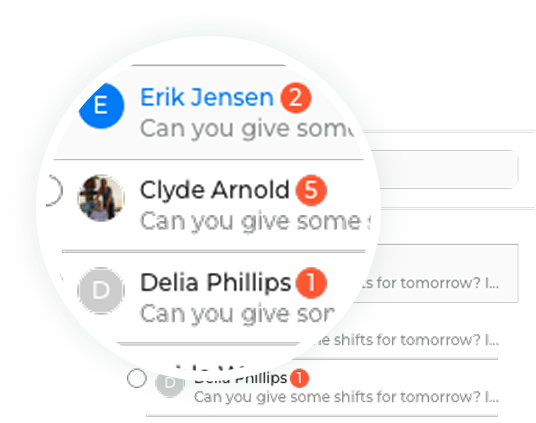
Notification logic
Add visual signals to handle missed replies
#2
Tooltip language refinement: for clarity, aligning the interaction model with user expectations.
#3
Overall feedback: No major usability issues were reported, validating both the feature’s discoverability and overall user flow.
Rollout Phase
Business Outcome
#3
Solved 9 ideas requested from customers valued at +23k MRR (Monthly Recurring Revenue)
#1
75% fewer clicks, better discoverability, and a smoother, more intuitive user experience
#2
Reduced support tickets related to missed messages by 40%
“This is a huge step forward!
”
Outcomes
SMS is now a key tool for real-time communication between the field and the office; we’ve brought this front and centre. SMS can be sent and received in real-time, from any part of the web app. The messages can be sent to individual workers and groups. Check out the help doc!
Instantly communication
Meaningful error messages for users.
Bulk SMS to individual workers or groups.
Support message templates
Support linking messages to a unique user ID, so if the user changes their phone number, we do not lose message history.
Rollout Phase
Business impact
Based on our research, we have developed the following strategy for this project:
#2
Adoption: For existing customers, having SMS front and centre, particularly incoming messages, will increase the use of Assignar as a messaging tool between the site and the field.
#1
Growth: Alongside the recently released Activity Feed, this new SMS view highlights our position as a real-time field-to-office communication platform to improve the on-site operational efficiency
Case#2 - Changing the Engineers teams mindset Done ≠ Delivered
Overview
In a fast-moving startup, our product and engineering teams were losing traction—features stuck behind flags, bugs left unresolved, and growing confusion about what was actually live. Work was being done, but not delivered.
My Role
Analysis of developed projects
Create jira board
Worked with PMs, Devs, to align the process
Impact
Faster full releases
Strong ownership of the project for feature flag and coding
Mindset shift from code to value and measurable impact
Problems
Shipping code isn’t the same as shipping value. We faced three core issues:
#1
Features behind feature flags are often incomplete and without clear owners.
#2
Bugs lingered across sprints, unnoticed or deprioritized.
#3
No shared visibility into what was in progress, blocked, or truly live.
Solution
With just one Jira board in play, I introduced a lifecycle-driven workflow to bring structure, clarity, and accountability. Key changes included:
#1
A redesigned pipeline showing each feature’s real status—blocked, in progress, released, or enabled per client.
#2
Flags for blockers with documented reasons, supporting better sprint planning.
#3
A dedicated space for success metrics, added during planning to align teams on outcomes from the start.
Outcomes
The shift brought alignment and momentum across the board:
#2
Stronger ownership: Engineers leaned into blockers, not just code.
#1
Faster releases: Weekly rhythms drove quicker iteration and bug fixes.
#3
Smarter planning: Conversations now center on value and measurable impact
Engineers takeaways:
“If you are not coding, you are not working = Bad engineer mentality”
ACTION: Group ownership
“Unblocking features faster”
ACTIONS: Weekly Goals.
“Joyce is a stellar designer who prioritizes understanding users and customers as humans first, and roles second. She constantly strives to better herself and her skills. She rallies behind her teams and drives a transparent culture that cultivates discussion and collaboration. Joyce was a joy to manage and partner with on a number of mission-critical projects for Assignar. She was key in driving our culture to fit the remote-first change in our organization by constantly contributing new ways to work successfully and asynchronously. She would be an incredible addition to any team. ”
THANKS FOR CHECKING IT OUT
Welcome to see my previous works on UI Design